Healthcare Analytics
Improving patient care with data-driven insights

NHS Appointment Data
Analysis
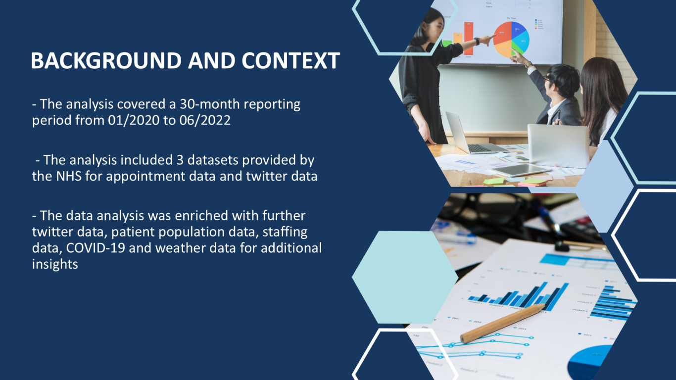
The analysis of 'fictious' NHS appointment data provided by the LSE Career Accelerator Course aimed to answer two main questions, was there enough capacity and staffing resources within the 30 month reporting period between 01/2020 to 06/2022. Additional data points were added to the provided datasets to obtain a more comprehensive analysis.
Healthcare Analytics in Action
NHS Appointment Data Analysis
The project focused on several appointment metrics based on fictious data provided by the LSE Career Accelerator course.
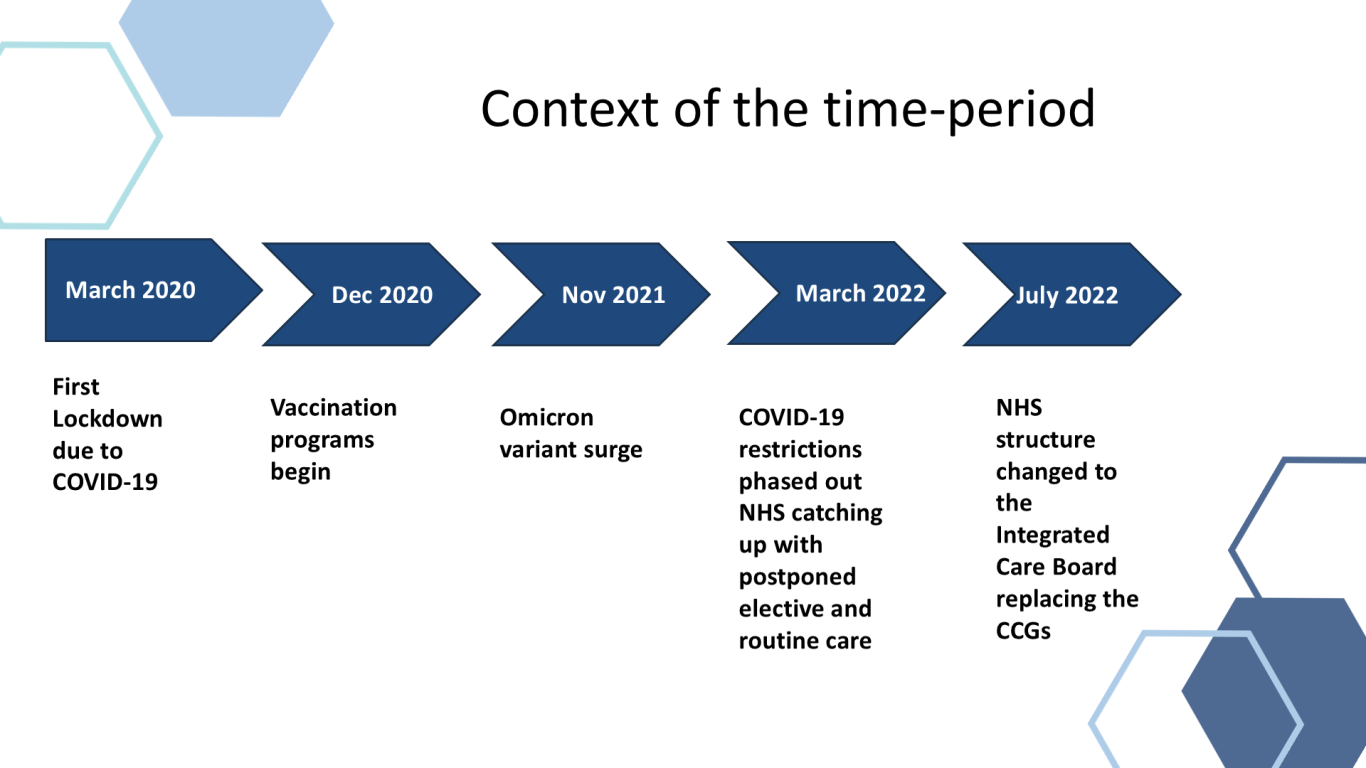
The period was heavily influenced by the Coronavirus pandemic

Appointment Mode
Appointment trend
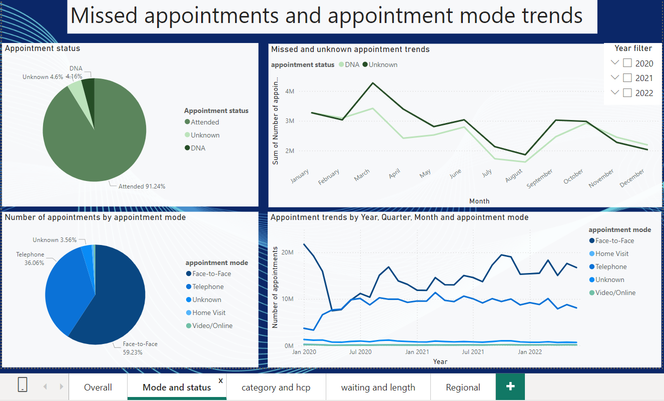
The first lockdown shown a sharp switch in face-to-face appointments to telephone appointments. However face-to-face appointments still remained the highest after this.
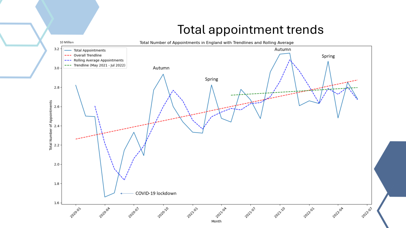
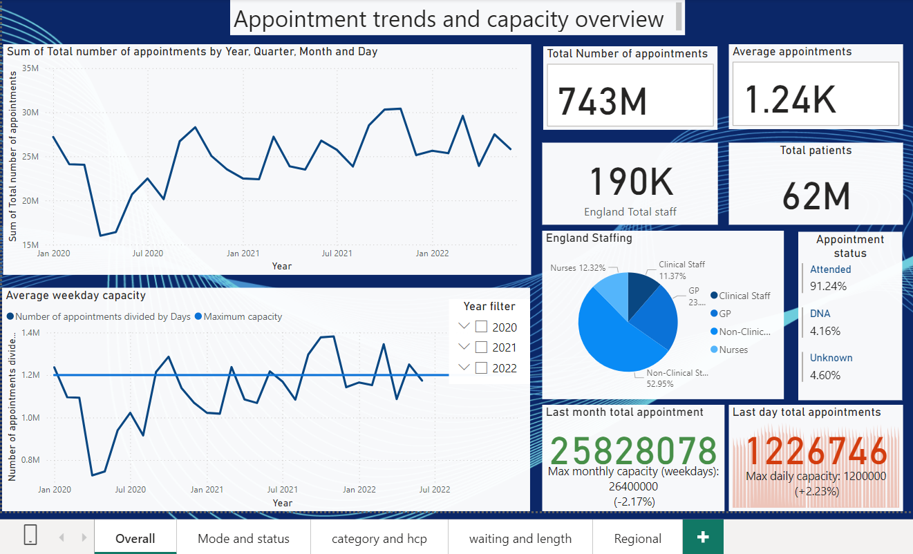
The overal appointment trend was increasing, however, when limited to the more stable last year the appointments were showing a stagnating trend.
Capacity
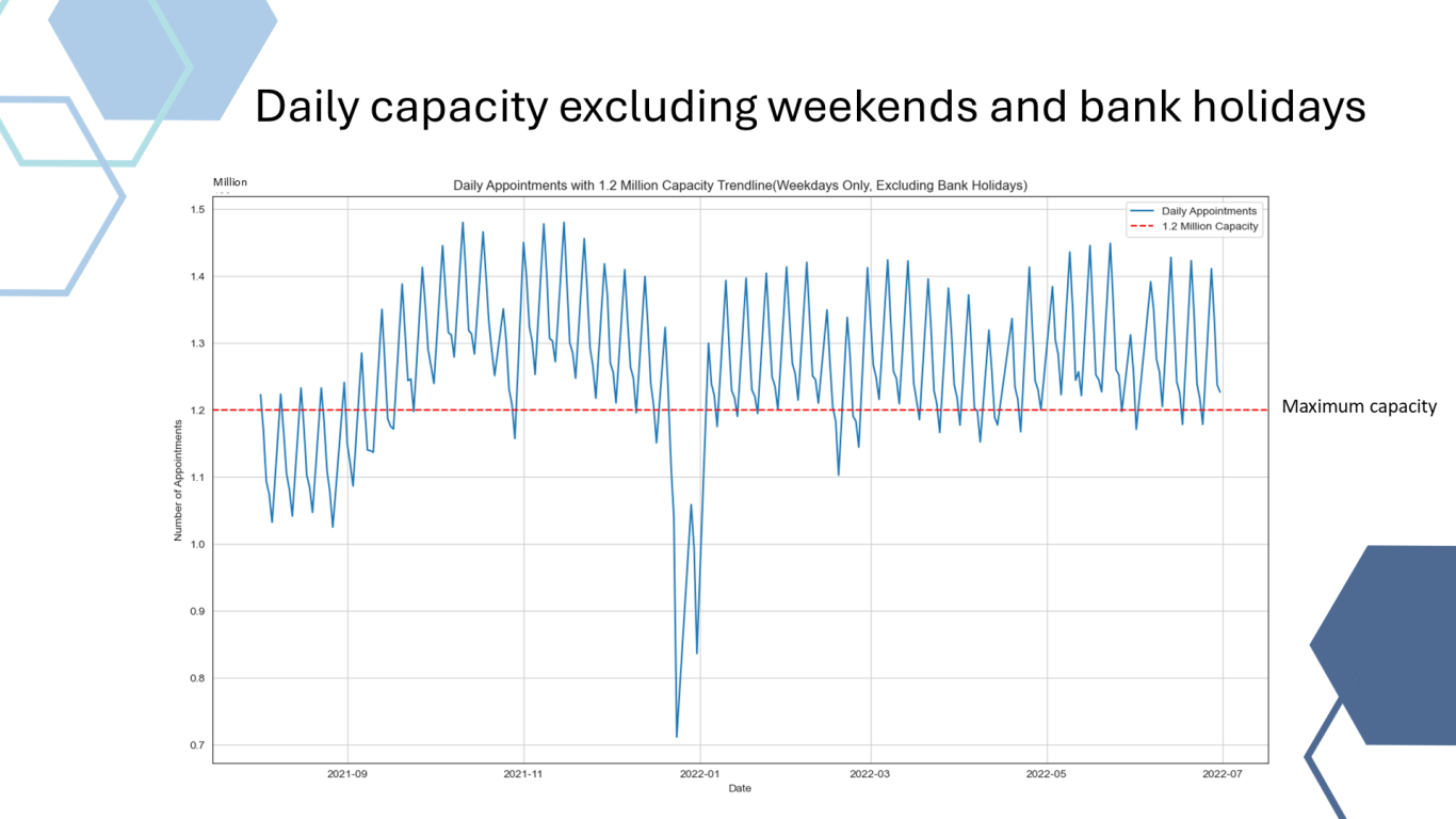
The NHS consistently breached it's provided 1.2 Million maximum daily capacity.
National Category
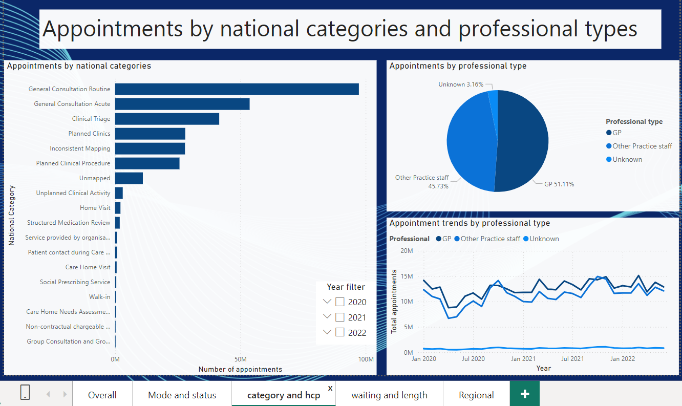
Routine and Acute general consultations and clinical triage were the main categories in terms of the appointment data
NHS Appointment Data Analysis Technical Report
This analysis aimed to evaluate the NHS's staffing adequacy, capacity, and resource utilization across different segments from January 2020 to July 2022, a period significantly impacted by the COVID-19 pandemic. Key findings reveal that the NHS operated above its capacity during peak periods, particularly on weekdays, with notable regional disparities in staffing. London, for instance, had lower staffing levels and higher missed appointment rates compared to other regions, highlighting the strain on resources in densely populated areas.
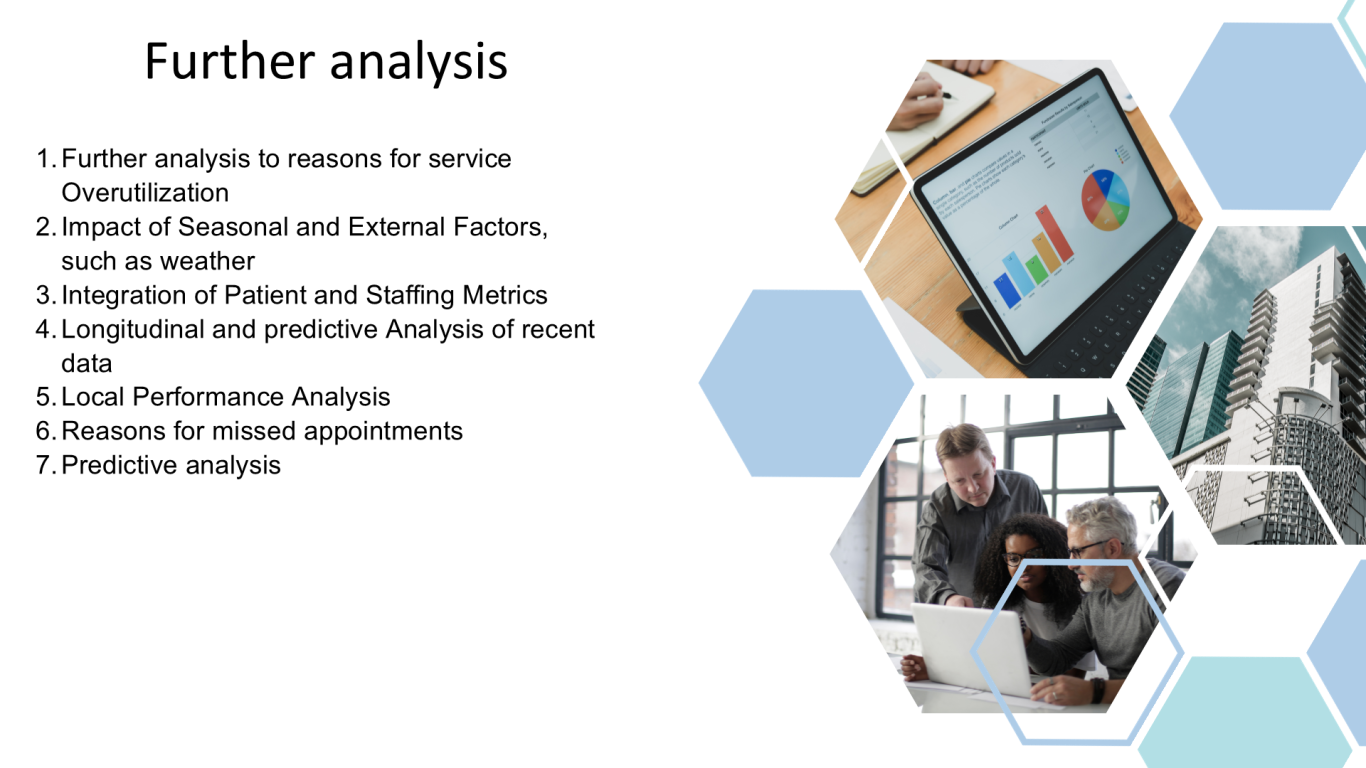
The analysis also showed a significant shift towards telephone consultations during the pandemic, although the adoption of video consultations remained low, indicating potential areas for improvement in telehealth services. Recommendations include increasing staffing during peak times, dynamic seasonal capacity and resource allocation, enhancing telehealth offerings, and implementing proactive patient engagement strategies to reduce missed appointments. Further research into the reasons for missed appointments, pandemic/seasonal illnesses and weather or other factors impacting on the service.
Background/context of the business scenario:
- The analysis was performed using python. See the additional information section below for the files.
- The primary objectives of this analysis were to evaluate staff adequacy and capacity, and to assess actual resource utilization across the NHS. Detailed business and analytical questions are provided in Appendix 1.
- Data provided: See Appendix 2. for details on the datasets provided. The appointment data covered a 30 month reporting period spanning from 01/2020 to 07/2022.
- Context: The time period was heavily influenced by COVID-19. It is important to note that the NHS functioned as Clinical Commissioning Groups during this period and the Integrated Care Boards were introduced at the end of this period in 07/2022. See additional details in Appendix 3.
- Problem analysis: The 5 Whys and SWOT problem-solving frameworks were used to gain deeper insights into the business problem, along with stakeholder mapping. See Appendix 4 for more details.
Analytical approach:
- The Jupyter notebook was organized into sections with a table of contents for easy navigation, improving workflow management.
- Key sections include setup, initial data checks, data cleaning, exploratory data analysis (EDA) and visualization, followed by answering individual questions and additional geographic analysis, predictive analytics and exploring additional relationships for COVID-19 and weather data. A PDF file was created to save EDA visualizations, visualisations for the business questions were saved as individual png files.
- Logging was used to execute multiple commands in a single block, reducing the notebook’s length.
- While some code blocks are repeated, especially datetime functions, the focus was on integrating data cleaning, EDA, and visualization into a repeatable workflow.
- Appendix 5 – includes a detailed insights into the codes and rationales used during this analysis.
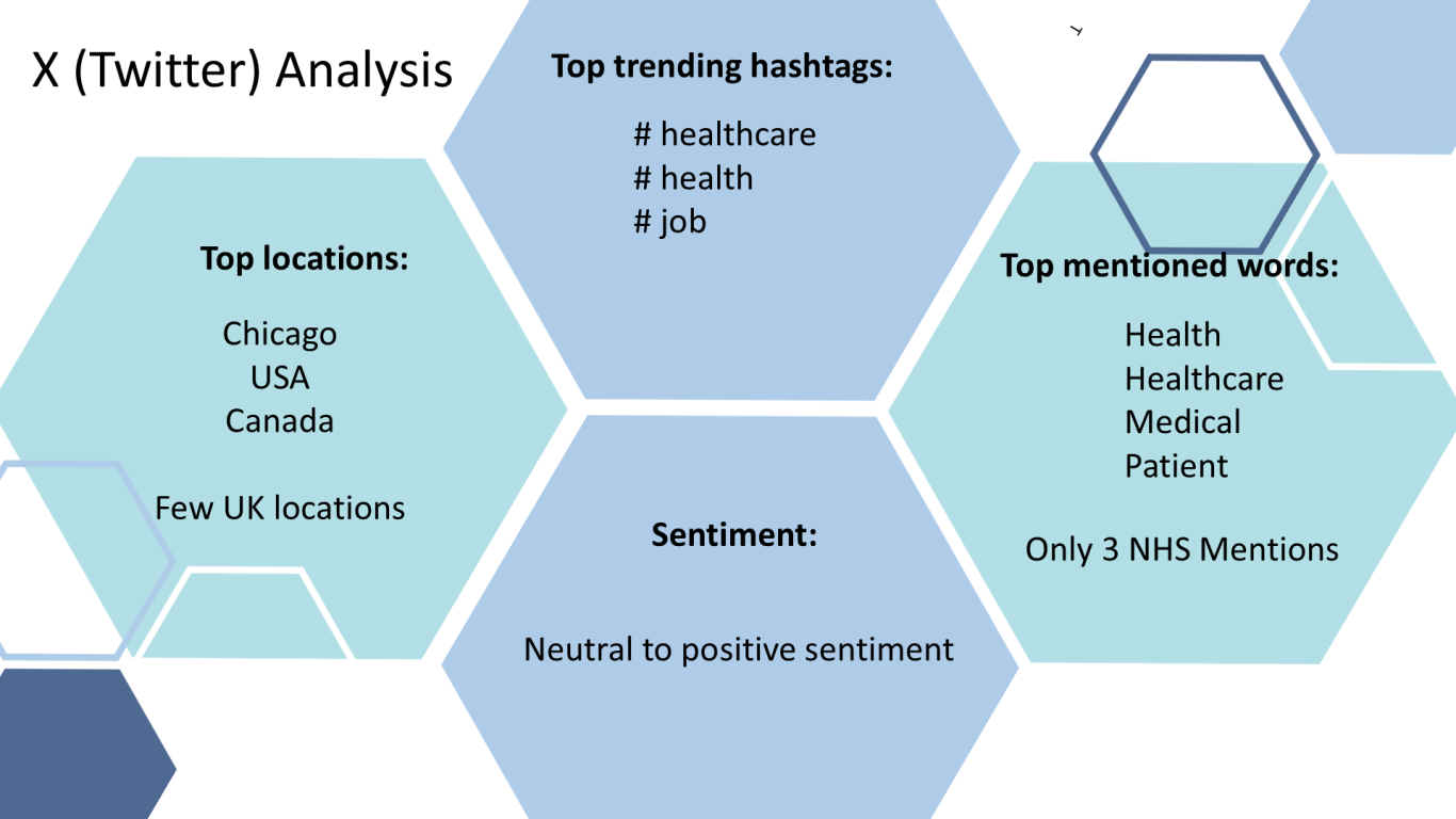
- Additional datasets, such as Twitter data, staffing levels, patient population, geographic data, weather, and COVID-19 data, were incorporated for broader insights. Although reliable sources were used, caution is advised in interpreting these data points. See Appendix 5 for more details.
- A limitation was the inability to merge all three main datasets due to memory constraints, leading to the analysis of datasets individually or in smaller merges. Given the different timeframes and daily/monthly data, merging would only provide insights for a smaller timeframe that all three files cover.
- The code of the jupyter notebook aimed to comply to the PEP 8 styling guide for python coding.
- # Comments were used throughout the notebook and markdown cells to display the results or separating sections. Line length compliance remains a limitation of the code.
- In some cases a styled output was coded to display the data in html or styled table rather than the pythonic output to improve user experience.
Visualisations and Insights:
- The Jypyter notebook has several visualisations. Not all visualisations were used to present to the stakeholders. Some visualizations were used primarily for analytical purposes, while others were tailored for stakeholder presentations.
- The visualizations for the stakeholder presentation have been carefully selected to address key business questions posed by the NHS, focusing on staff adequacy, resource utilization, and appointment patterns. The goal is to provide clear, actionable insights into these areas by visually representing the data in a way that is both intuitive and informative. Each visualization is chosen to highlight specific trends, patterns, and correlations that are critical to understanding the operational efficiency and challenges within the NHS's network of care providers. As the additional weather and COVID-19 data did not yield considerable insights, these were not included in the stakeholder presentation.
- The visualisation process often required several trials before the created visualisation looked presentable. One main issue was the overlapping text on the x axis. Often the axis had to be switched or the text rotated by 45-90 degrees to avoid overlapping. Appendix 6. Has further information on the rationale of the selection of the visualisations for business stakeholders. Several types of visualisations were used in the notebook, such as scatter plots, boxplots, bar and line charts and maps.
- Please refer to the jupyter notebook, the saved files and the presentation for the available visualisations. See appendix 6 for the rationale of the selected visualisations for the business stakeholders.
Service utilization insights:
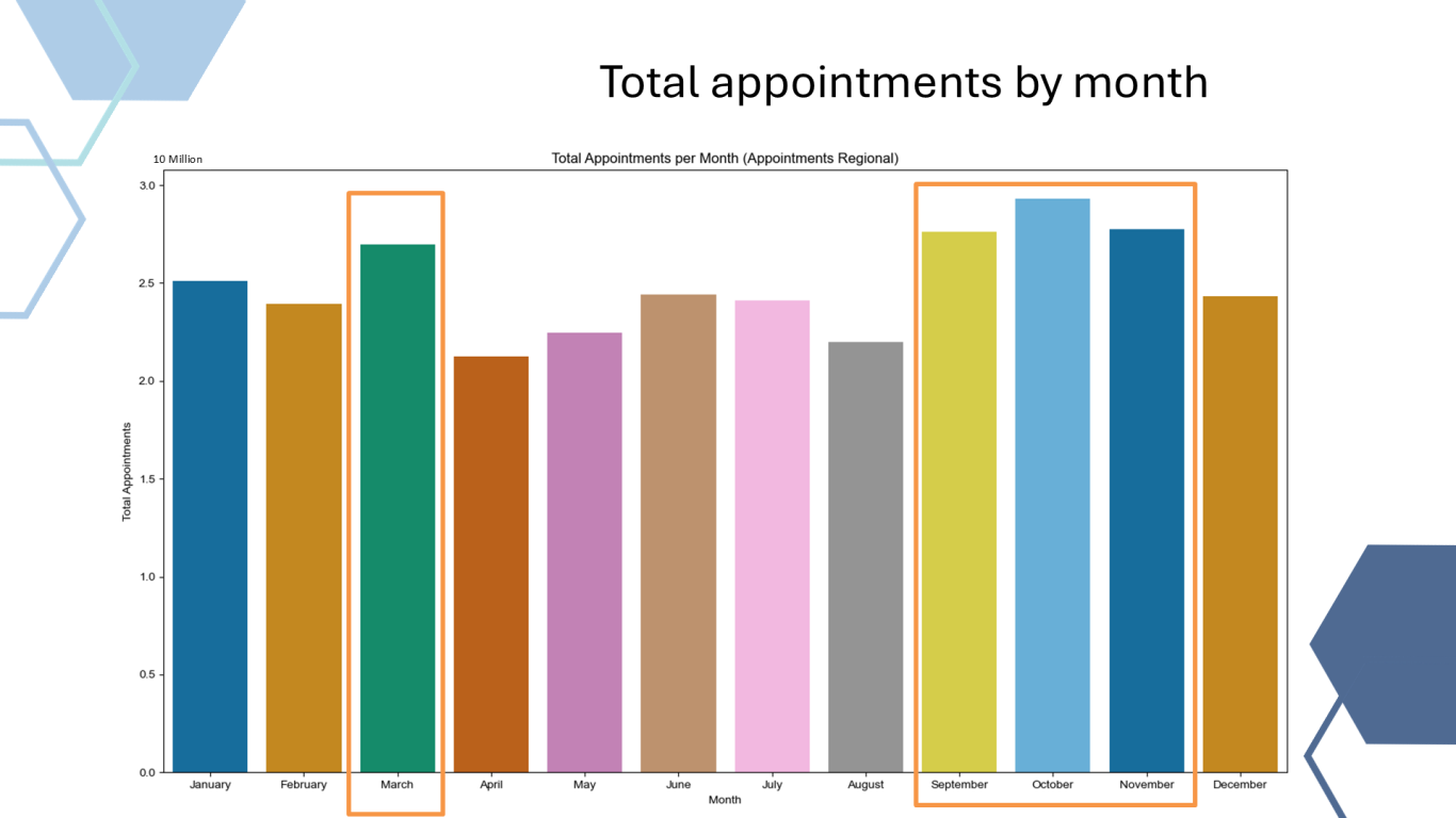
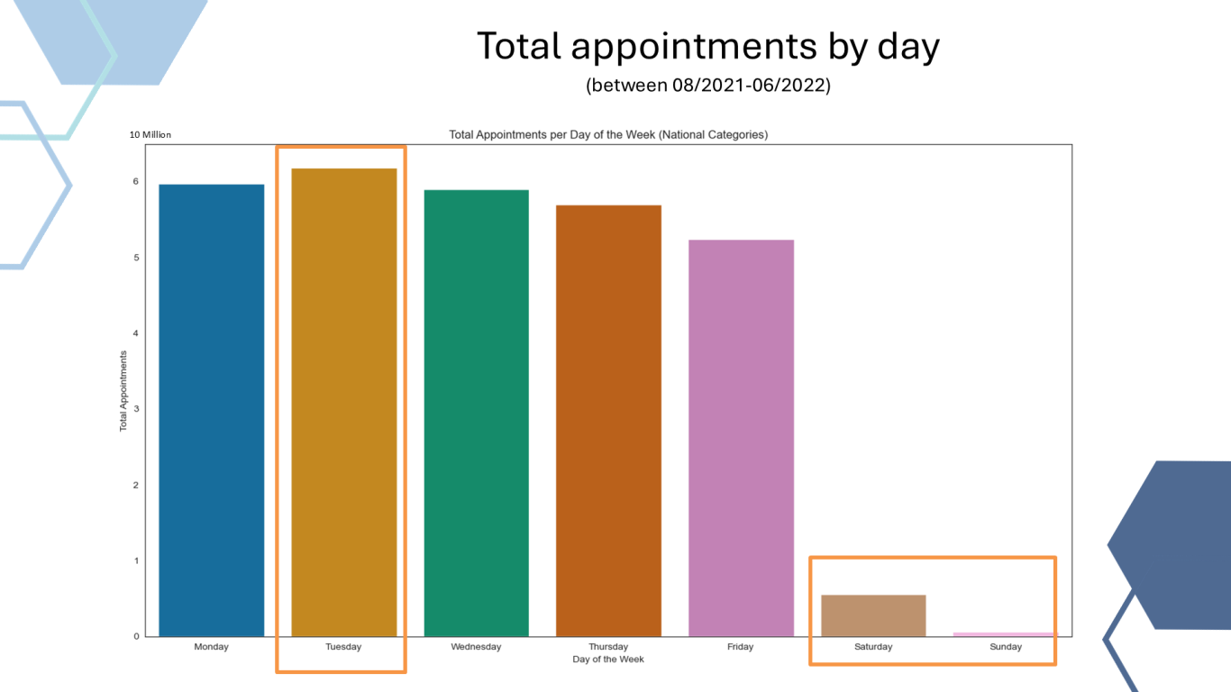
- Appointment patters: Tuesdays were the busiest days, whilst there is a low appointment count at the weekends, suggesting that only few practices operate during the weekends. September to November and March are the busiest months, whilst April and August the quietest. (likely due to staffing levels during holiday periods). Spring and Winter were the most demanding seasons.
- Capacity threshold: The suggested 1.2M capacity threshold was not breached when all days of the month was included, however when weekend days were accounted for NHS functioned beyond this threshold the majority of times.
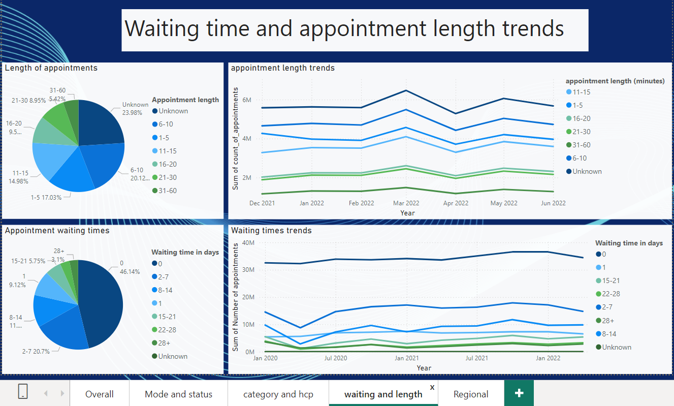
- Appointment duration: 42.2% of appointments were over 20 minutes long indicating time demands of staff
- Unmapped appointments for context types, national categories, service settings followed a similar declining pattern. Potential improvement in the recording of these appointments or using a different mapping of the appointments.
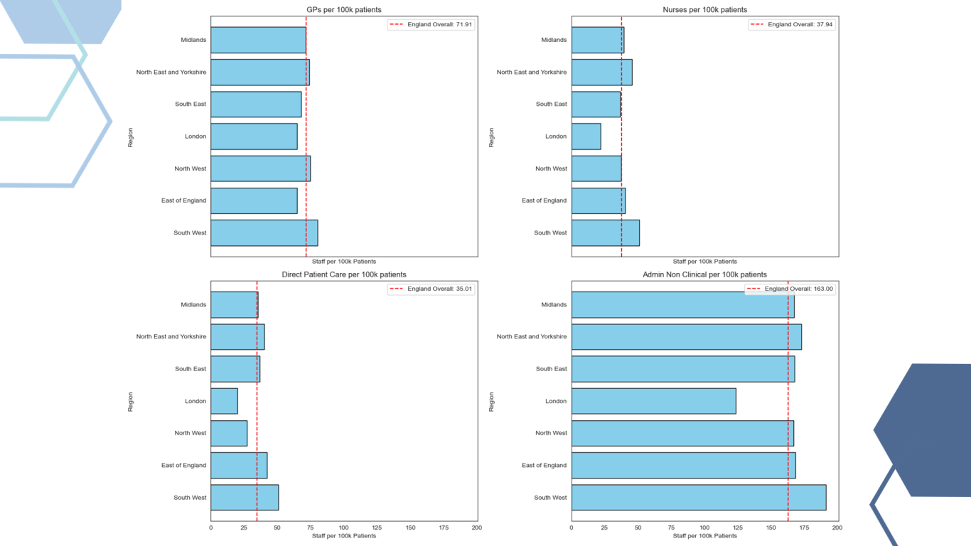
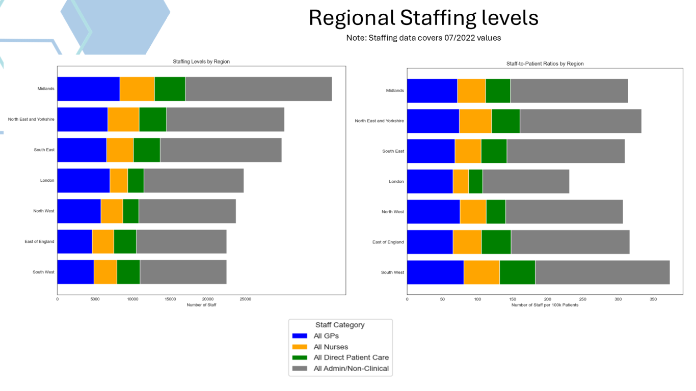
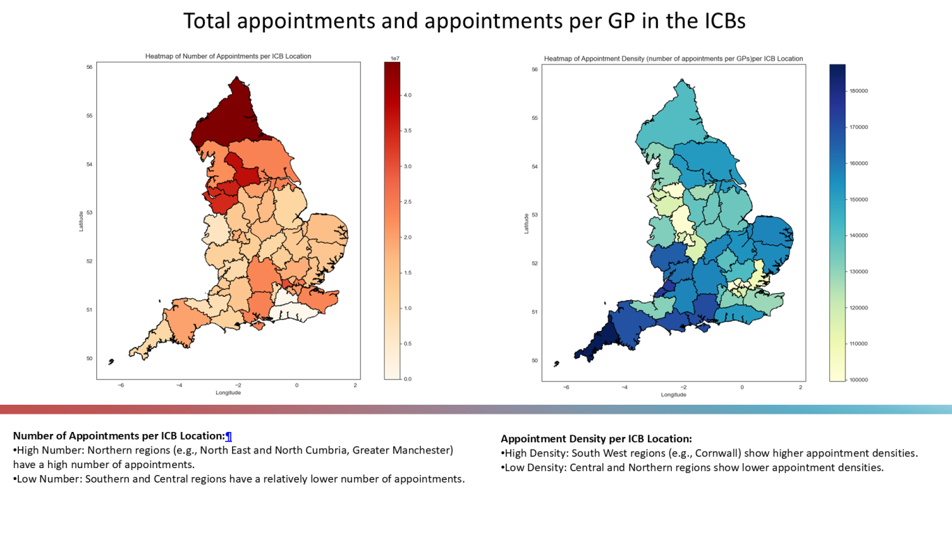
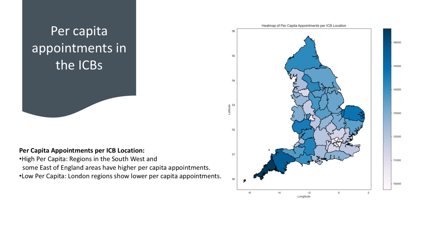
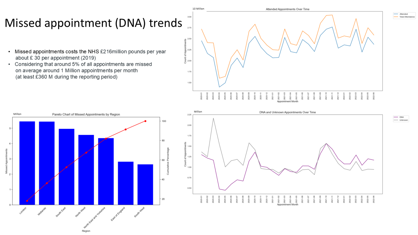
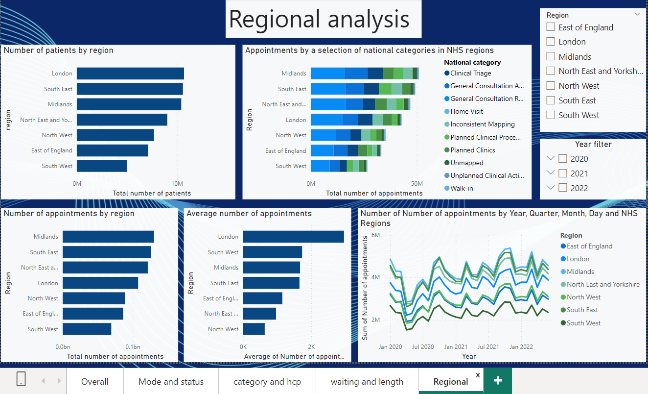
- Regional analysis highlighted differences between regions and ICB analysis highlighted differences between rural and urban ICBs. In terms of staffing South West had above England average staffing levels, whilst London had the lowest averages for all GP staffing groups. London also contributed to the highest number of missed appointments.
- COVID-19 Impact: The initial lockdown led to a shift from face-to-face to telephone appointments. Video/online modes remained low throughout the reporting period.
Patterns and predictions:
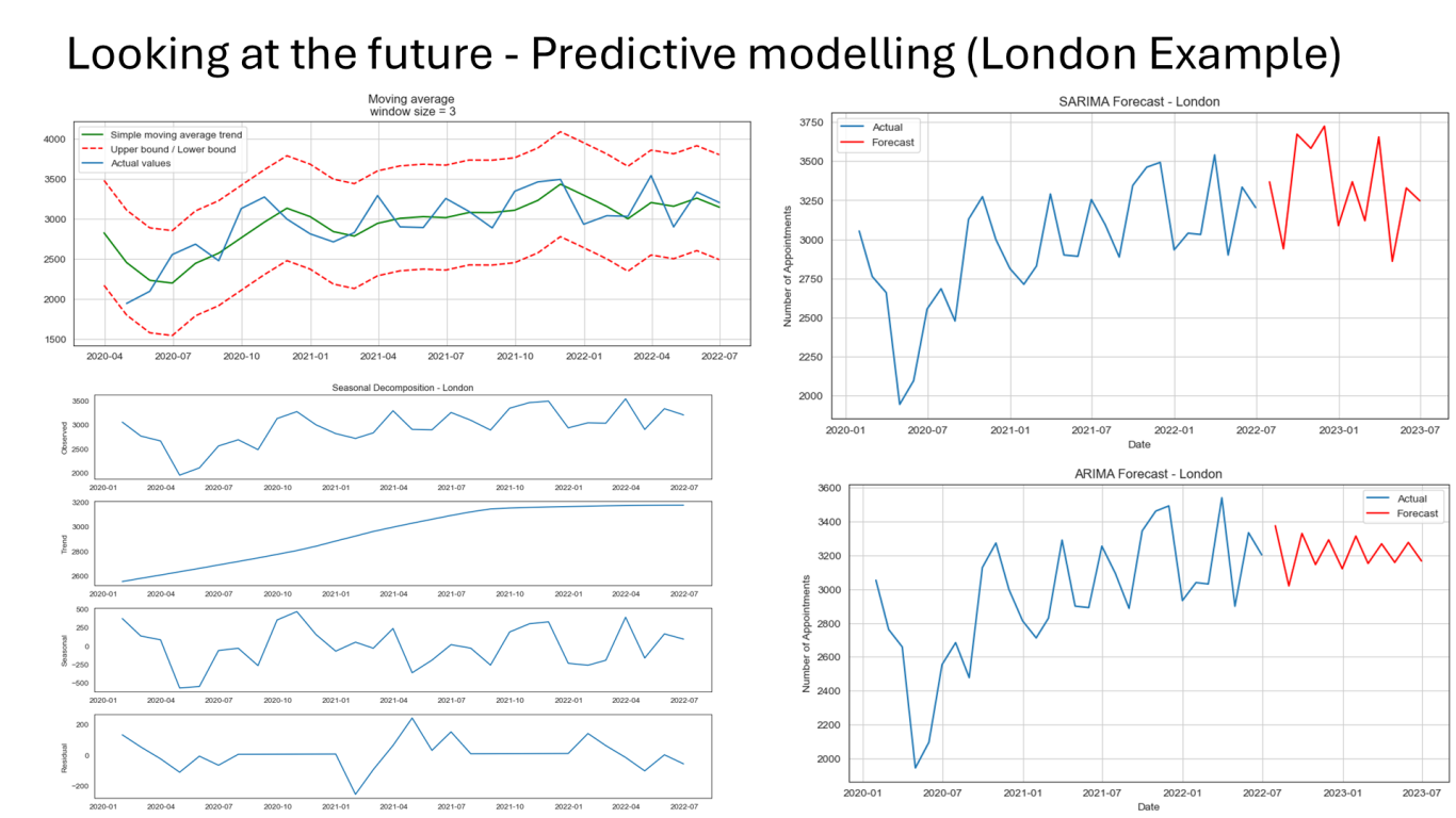
- Trend analysis: When trends were explored over the reporting period appointment numbers shown an increasing trend, however when it was limited only for the last year the trends were showing a stagnant overall appointment trend. Indicating the potential impact of COVID-19 restrictions and routine appointment handling.
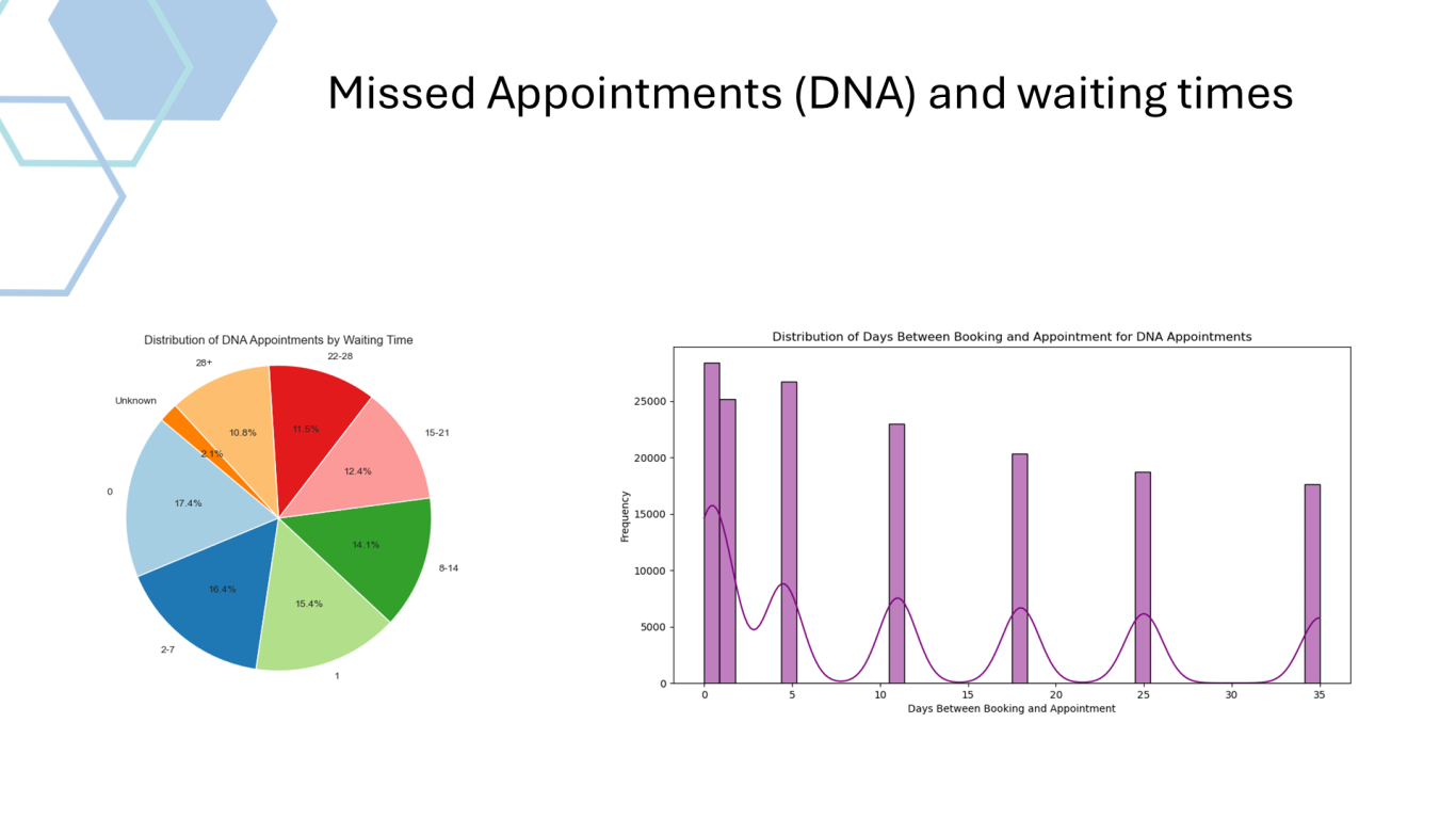
- Average wait times were around 12 days, and both appointment length and wait times followed similar trends.
- Predictive analytics: SARIMA predictions were successful over the full period but not for the final year, highlighting limitations in shorter datasets. Only ARIMA method was included in the submitted files for the last year.
Recommendations:
- Service Improvements: Detailed recommendations for service enhancements and further data analysis are included in Appendix 7, emphasizing the need for improved data integration and predictive capabilities.
Python Analysis Results
See below the main insights from the python analysis.



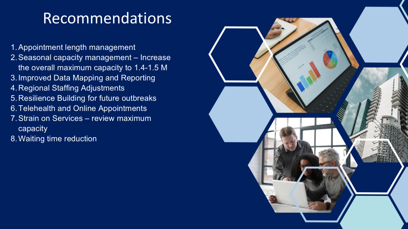
Please refer to the the presentation for the full slide deck.
Power BI dashboard view of the analysis
Additional Information
Use the following Github link to access the files used in the data analysis. Please note that some files are not included in the Github repository due to their file size. If you would like to run the .ipynb file code with all the necessary files, please do not hesitate to contact me. See below the links for the presentation and the full report.
Need tailored healthcare data analytics solutions? Let’s transform your data!
Book a consultation today to discover how I can deliver actionable insights to drive your success!
Stay Updated with Data Insights

Welcome to my blog, where I share valuable information and perspectives on database management and data analysis services.
Explore my latest articles to stay informed and discover new trends in the ever-evolving world of data.
Whether you are a business owner, entrepreneur, or data enthusiast, my blog is the perfect resource for enhancing your knowledge and optimizing your data processes.
Join me on this journey of learning and innovation in the realm of database management and data analysis.
