Top 5 Data Visualization Techniques for Healthcare Professionals
Written By: Beata Faitli
Published on: 04.04.2025
Data visualization is a powerful tool in healthcare analytics, enabling professionals to transform complex data into comprehensible visual formats. Effective visualizations not only enhance the understanding of data but also support informed decision-making, improve patient outcomes, and optimize healthcare operations. This article explores the top five data visualization techniques that are revolutionizing healthcare analytics, offering practical insights and applications for each method. From heat maps to scatter plots, these visual tools provide healthcare professionals with the means to interpret and utilize data more effectively
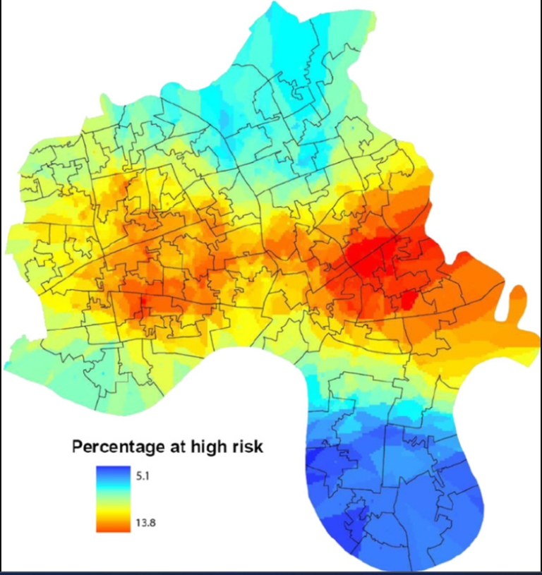
1. Heat Maps (1)
Overview:
Heat maps are powerful visualization tools that use color gradients to represent data values across a two-dimensional space. Each data point is assigned a color based on its value, creating a visual spectrum that highlights areas of varying intensity. This method is particularly effective for identifying patterns, trends, and outliers at a glance, making it invaluable in the fast-paced healthcare environment where quick insights can significantly impact decision-making.
In healthcare, heat maps can be used to visualize geographic data, such as tracking the spread of infectious diseases or identifying regions with high patient admission rates. By overlaying heat maps on geographical maps, healthcare professionals can pinpoint hotspots and allocate resources more efficiently. Additionally, heat maps are useful for analyzing patient flow within hospital facilities, helping to identify bottlenecks and optimize operations to enhance patient care and experience.
Applications in Healthcare:
- Patient Admission Rates: Visualize areas with high patient admission rates, helping hospitals allocate resources more efficiently.
- Disease Spread Monitoring: Track the spread of infectious diseases geographically to inform public health interventions.
- Patient Flow Analysis: Analyze patient movement within hospital facilities to identify bottlenecks and optimize operations.
Practical Tips:
- Color Gradients: Use intuitive color gradients (e.g., from blue to red) to represent data ranges.
- Combination with Maps: Overlay heat maps on geographic maps for spatial analysis of data.
- Interactive Elements: Incorporate interactive elements to allow users to drill down into specific data points.
2. Scatter Plots (2)
Overview:
Scatter plots are essential tools for visualizing the relationship between two variables within a dataset. Each data point on a scatter plot represents an observation's values for the two variables, plotted on a Cartesian plane. This visualization technique is highly effective for identifying correlations, trends, and outliers, which can lead to valuable insights in healthcare analytics.
For instance, scatter plots can be used to explore the relationship between patient age and recovery times, providing insights into how different age groups respond to treatments. Similarly, they can help investigate the correlation between medication dosages and the incidence of side effects, aiding in the optimization of treatment protocols. By adding trend lines or using different markers and colors, healthcare professionals can further enhance the clarity and interpretability of scatter plots, making them a versatile tool for comprehensive data analysis.
Applications in Healthcare:
- Age and Recovery Time: Examine the relationship between patient age and recovery times to tailor treatment plans.
- Medication Dosage and Side Effects: Investigate how different medication dosages correlate with the occurrence of side effects.
- Treatment Protocols: Track patient outcomes based on different treatment protocols to identify the most effective approaches.
Practical Tips:
- Large Datasets: Use scatter plots for large datasets to gain comprehensive insights.
- Differentiation: Use different markers or colors to distinguish between patient groups or treatment types.
- Trend Lines: Add trend lines to highlight significant correlations.
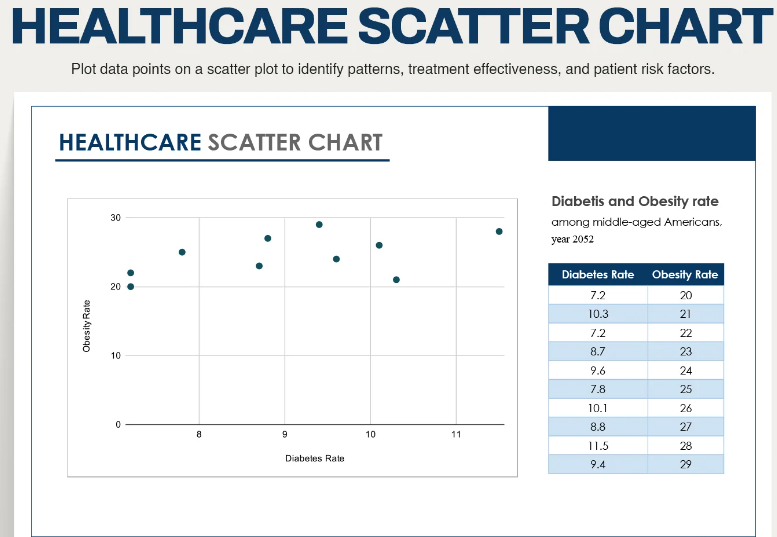
Picture 2. Example of a scatter Plot
Source: https://www.template.net/editable/126751/healthcare-scatter-chart
3. Line Charts (3)
Overview:
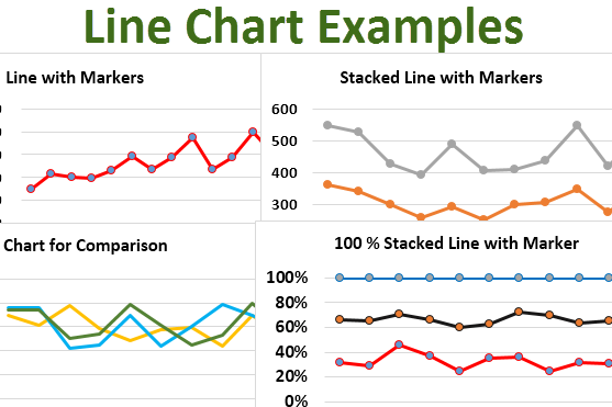
Line charts are a fundamental visualization tool for displaying data trends over time. By connecting individual data points with straight lines, line charts effectively illustrate how values change across different time intervals. This makes them particularly useful for time-series data, where understanding trends and patterns over time is crucial.
In the healthcare sector, line charts are commonly used to monitor patient vitals, such as heart rate, blood pressure, and temperature, over the course of treatment. They can also track the incidence of diseases over months or years, helping public health officials detect trends and seasonal patterns. Additionally, line charts are valuable for analyzing hospital admissions and discharges, enabling healthcare managers to make informed decisions about staffing and resource allocation. Utilizing multiple lines to compare different datasets or highlighting significant data points with markers can further enhance the utility of line charts in healthcare analytics.
Applications in Healthcare:
- Patient Vitals: Track patient vitals such as heart rate, blood pressure, and temperature over time.
- Disease Incidence: Monitor the incidence of diseases over months or years to detect trends and seasonal patterns.
- Hospital Admissions: Analyze trends in hospital admissions and discharges to improve staffing and resource allocation.
Practical Tips:
- Multiple Lines: Use multiple lines to compare different datasets or patient groups.
- Significant Data Points: Highlight significant data points with markers or annotations.
- Consistent Intervals: Ensure time intervals on the x-axis are consistent and clearly labeled.
4. Bar Charts (4)
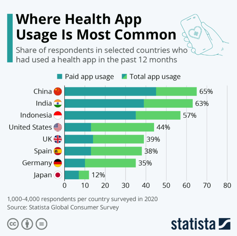
Overview: Bar charts are a popular choice for comparing data across different categories or groups. Each rectangular bar in a bar chart represents a data value, with the length of the bar corresponding to the value it represents. This straightforward visual representation makes bar charts an effective tool for highlighting differences and making comparisons.
In healthcare, bar charts are often used to compare the number of patients treated across different departments, providing a clear visual of departmental workload and resource utilization. They can also be used to analyze the distribution of various medical conditions among patient populations, offering insights into prevalent health issues. Bar charts are particularly useful for displaying the frequency of different diagnostic procedures, helping healthcare professionals understand which procedures are most common and allocate resources accordingly. By using grouped bars for comparative analysis or horizontal bars for categories with long labels, bar charts can be customized to enhance readability and clarity.
Applications in Healthcare:
- Department Comparisons: Compare the number of patients treated in different hospital departments.
- Condition Distribution: Analyze the distribution of various medical conditions among patient populations.
- Diagnostic Procedures: Display the frequency of different diagnostic procedures performed in a healthcare facility.
Practical Tips:
- Horizontal Bars: Use horizontal bars for categories with long labels to enhance readability.
- Grouped Bars: Group bars to facilitate comparative analysis between different groups or time periods.
- Consistent Colors: Apply consistent colors to maintain clarity and avoid confusion.
5. Pie Charts (5)
Overview:
Pie charts provide a visual representation of the proportions of a whole by dividing a circle into slices, with each slice representing a category's contribution to the total. This visualization technique is effective for illustrating the composition or distribution of data within a single dataset, making it easy to understand relative proportions at a glance.
In healthcare, pie charts can be used to show the proportion of different types of treatments administered to patients, giving a clear overview of treatment distribution. They are also useful for displaying the allocation of hospital resources among various departments, helping administrators ensure balanced and efficient use of resources. Additionally, pie charts can analyze patient demographics, such as age groups or gender distribution, providing valuable insights into the characteristics of the patient population. To ensure clarity, it is important to limit the number of slices in a pie chart and use distinct colors and data labels to highlight each category's contribution.
By leveraging these detailed visualization techniques, healthcare professionals can effectively transform raw data into actionable insights, driving better decisions and ultimately improving patient outcomes.
Applications in Healthcare:
- Treatment Types: Show the proportion of different types of treatments administered to patients.
- Resource Allocation: Display the share of hospital resources allocated to various departments or activities.
- Patient Demographics: Analyze patient demographics, such as age groups, gender distribution, or insurance coverage types.
Practical Tips:
- Limit Slices: Limit the number of slices to avoid clutter and ensure the chart remains readable.
- Distinct Colors: Use distinct colors for each category to enhance visual differentiation.
- Data Labels: Include data labels or percentages on each slice to provide exact values and improve comprehension.
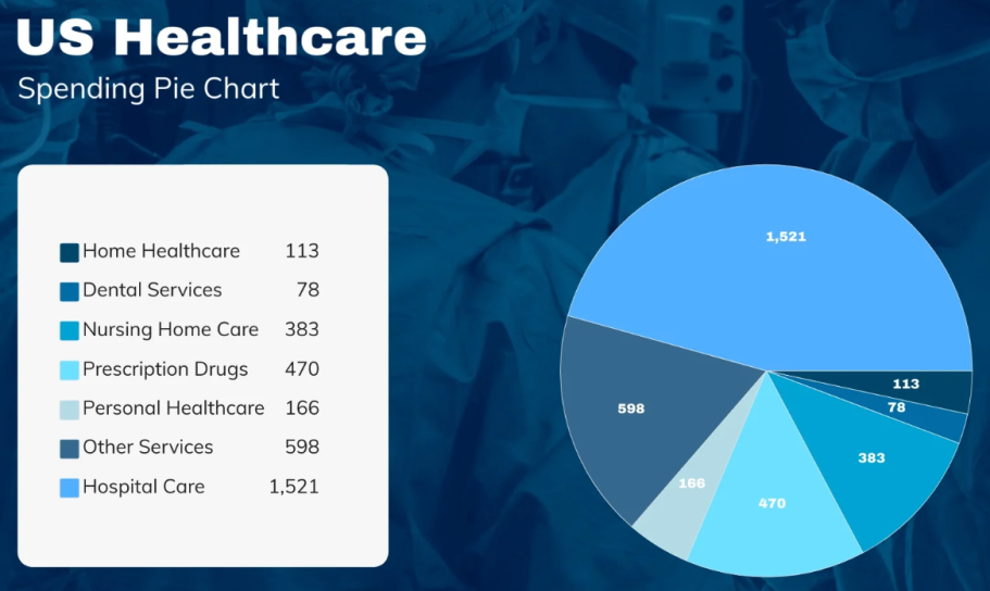
Picture 5. Bar Chart Example
Source: https://assets.visme.co/templates/banners/thumbnails/i_US-Healthcare-Spending-Pie-Chart_full.jpg
Conclusion
Effective data visualization is crucial in the healthcare sector, enabling professionals to interpret complex data quickly and accurately. The five techniques discussed—heat maps, scatter plots, line charts, bar charts, and pie charts—each offer unique advantages that can significantly enhance the understanding and utilization of healthcare data.
By implementing these visualization tools, healthcare professionals can uncover valuable insights, identify trends, and make more informed decisions that lead to improved patient outcomes and optimized resource management. Embracing these methods not only facilitates a deeper comprehension of data but also fosters a more data-driven approach to healthcare, ultimately contributing to a more efficient and effective healthcare system.
Enjoyed this article? Share it on social media and spread the knowledge!
REFERENCES
- How Heat Maps Help in Data Visualization - https://help.tableau.com/current/pro/desktop/en-us/buildexamples_highlight.htm
- What is a Scatter Plot and When to Use It - https://www.jmp.com/en_us/statistics-knowledge-portal/exploratory-data-analysis/scatter-plot.html
- Line Chart: Definition, Examples, Make one in Excel - https://www.statisticshowto.com/line-chart/
- How to Use Bar Charts to Show Comparisons in Your Data - https://datavizcatalogue.com/methods/bar_chart.html
- Pie Charts: How to Use and When to Avoid - https://www.perceptualedge.com/articles/08-21-07.pdf
- Picture 1. https://www.researchgate.net/profile/Trisha-Greenhalgh/publication/221835562/figure/fig1/AS:305611368615936@1449874836265/Heat-map-showing-percentage-of-adult-population-at-high-risk-of-diabetes-using-a.png
- Picture 2. https://www.template.net/editable/126751/healthcare-scatter-chart
- Picture 3. Source - https://pixalu.com/images/345546.png
- Picture 4. https://cdn.statcdn.com/Infographic/images/normal/23161.jpeg
- Picture 5. https://assets.visme.co/templates/banners/thumbnails/i_US-Healthcare-Spending-Pie-Chart_full.jpg
Website Image sources:
Pexels - https://www.pexels.com/ and Pixabay - https://pixabay.com/
Interested in learning how these insights can apply to your organization?
Book a consultation today to discover how I can deliver actionable insights to drive your success!
Feedback & Comments
Please share your thoughts and feedback on the article below. I'm interested in hearing your perspectives and insights on the topics discussed. What stood out to you, and what would you like to learn more about?
Back to Main Blog
Optimizing Database Management for Improved Healthcare Outcomes
Check out my Dashboards and detailed Data Analysis Projects
We need your consent to load the translations
We use a third-party service to translate the website content that may collect data about your activity. Please review the details in the privacy policy and accept the service to view the translations.

